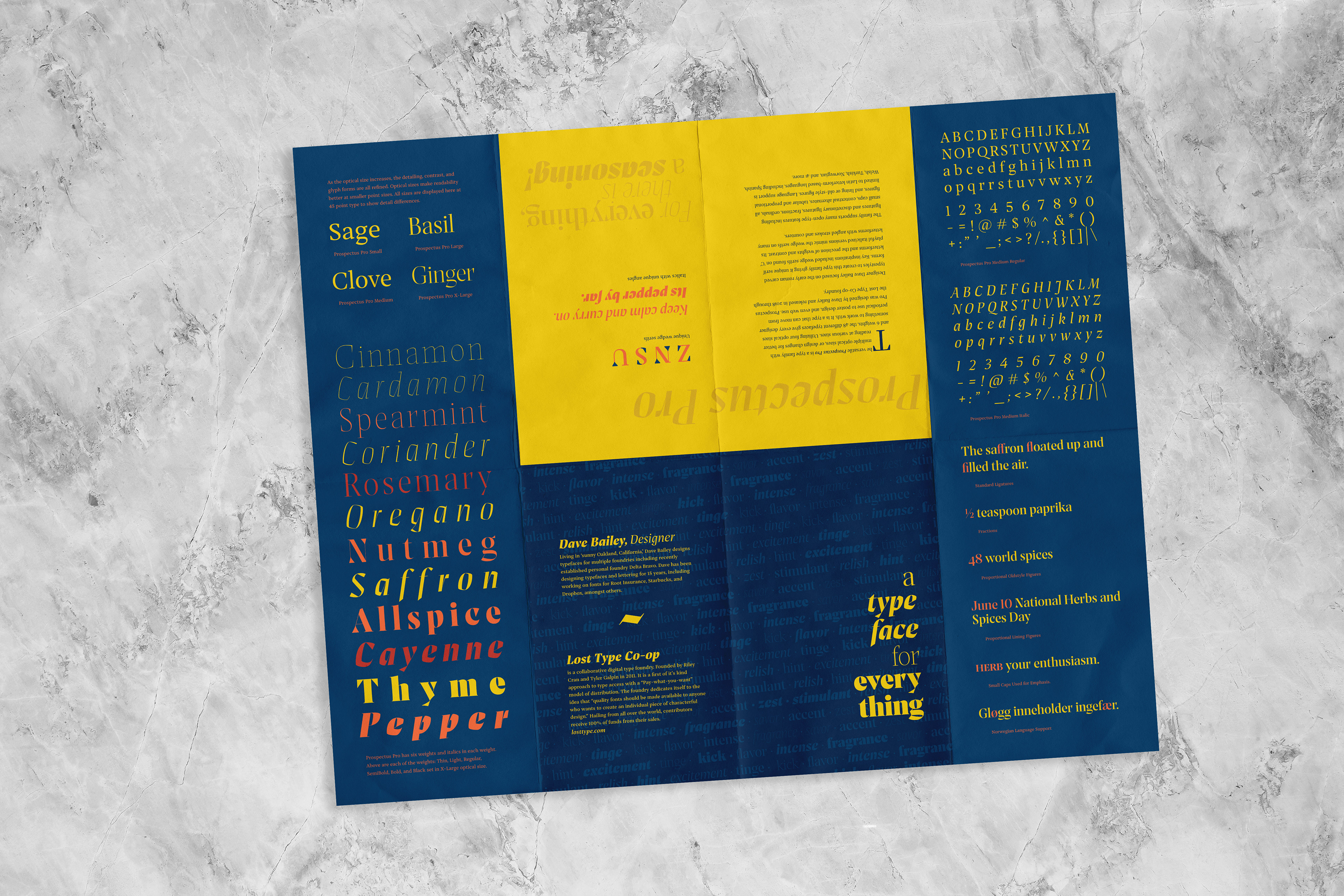
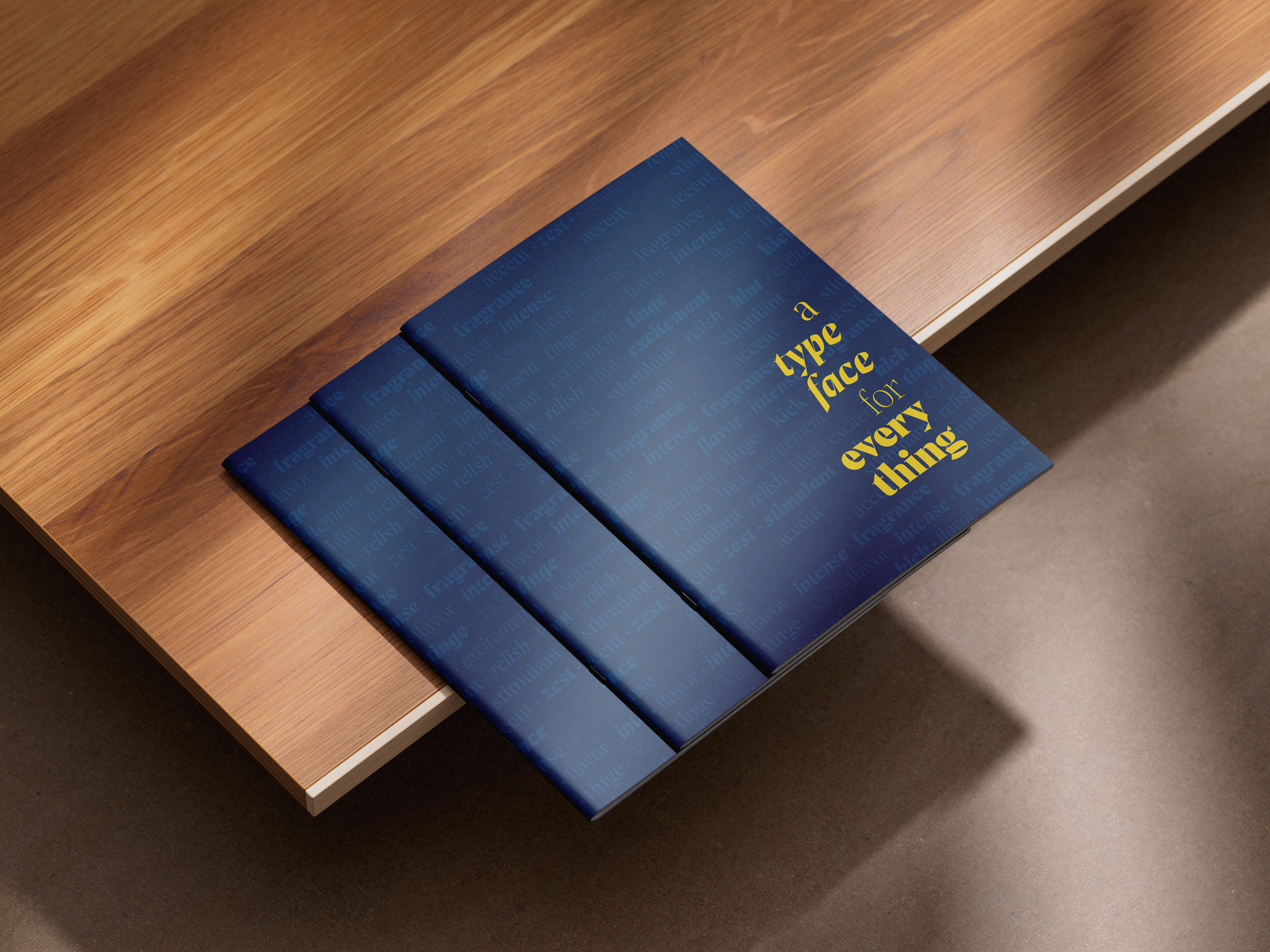
Concept: Variety is the spice of life.
The Problem: Create a multi-fold booklet that shows the special qualities of Prospectus Pro typeface by Dave Bailey of Lost Type Foundry.
Project Specs: 20 in x 16 in double sided poster print with multi-fold layout
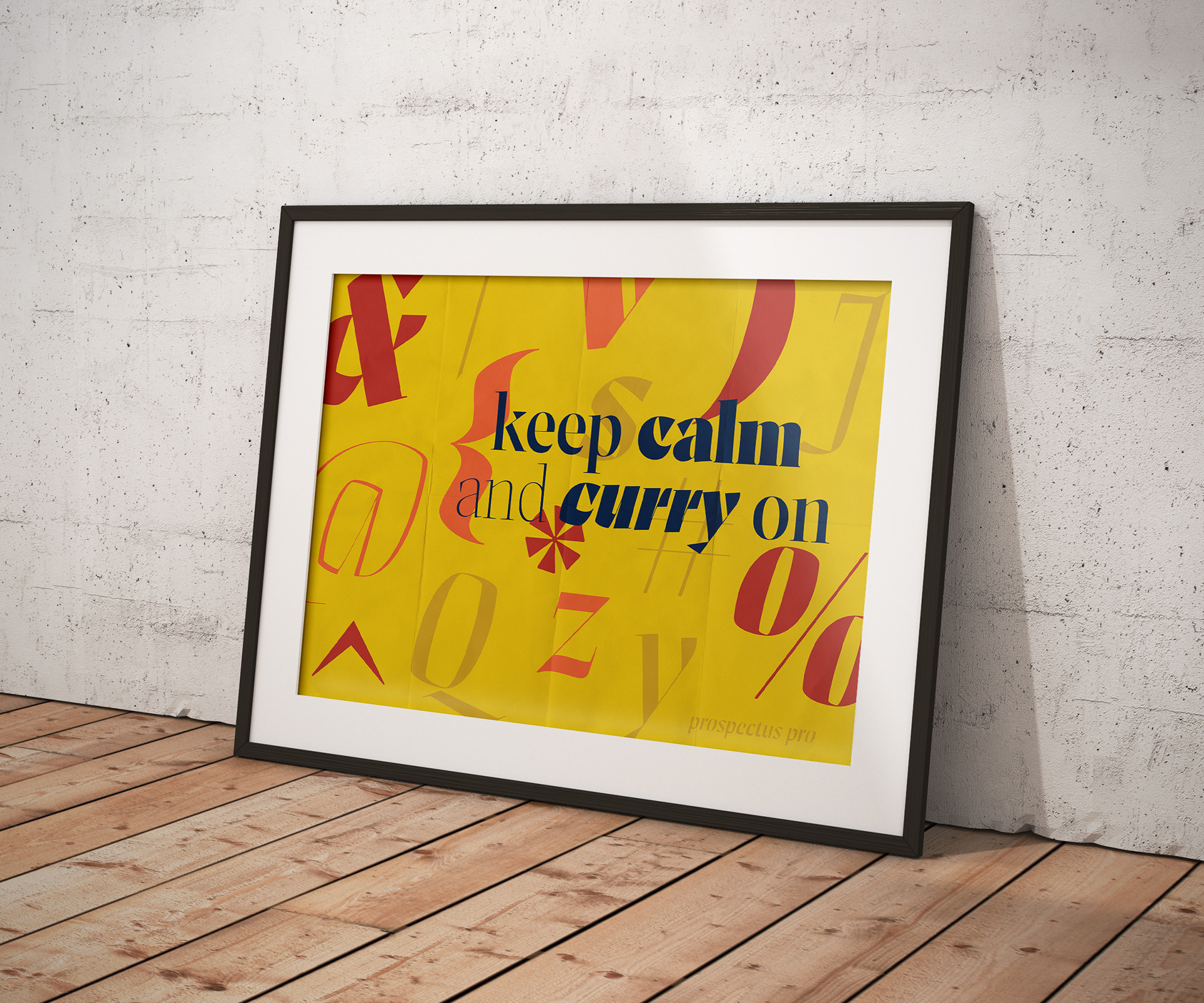
I wanted to highlight the range of options in styling the unique typeface, Prospectus Pro. While making this booklet, I focused on increasing contrast and detailing in the type as optical size and weights change. Echoing the contrast in the type, bold bright colors inspired by spice markets in India gave a perfect background.
I created the booklet to be a fun journey through ongoing panels, culminating in a final 16x20 poster. Inside the viewer is greeted with a textured array of letterforms showcasing interesting weights and italics. Don’t forget to keep calm and curry on!